There are many types of spreadsheet charts and graphs. Mathematics, via formulas in cells, may power the engine of a spreadsheet, but graphs are more than a fancy paint job. Data visualization adds enormous value to a spreadsheet.
After all, this is one of the primary reasons to use spreadsheet software like Google Sheets or Microsoft Excel. So let’s discuss what options you have when it comes to charts and graphs.
Common Types of Charts and Graphs
Here are the most common types of graphs you’ll find in a spreadsheet. We’ll also point out our most popular guides for each.
Line Graph
In contrast to the discrete bars of a bar graph, a line chart (or line graph) connects data points using straight lines. This type of graph is particularly useful for illustrating trends and changes over a continuous interval.
Line graphs are adept at showcasing patterns, making them valuable for tracking data fluctuations over time and identifying relationships between variables.
Pie Chart
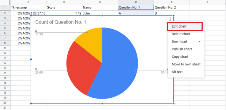
Unlike other types of charts, this one doesn’t have a horizontal or vertical access. A pie chart is a graphical representation that displays data points in a circular graph, resembling a pie divided into slices.
Each slice represents a proportionate part of the whole, showcasing the distribution of values within a dataset. It’s exceptionally helpful when you want to see the part-to-whole relationship. (They’re even built into some programming languages!)
This type of chart is particularly effective for illustrating the composition of a whole in terms of percentages or proportions.
Bar Graph
A bar graph is a powerful visual tool that presents data using rectangular bars of varying lengths. Each bar corresponds to a specific category, and the length of the bar represents the value of the data it represents.
Bar graphs are effective for comparing and contrasting different groups or categories, offering a straightforward and intuitive way to interpret data variations.
Scatter Plot
A scatter plot is a graphical representation that displays individual data points on a two-dimensional graph. Each point on the plot represents a unique set of values for two variables (shown by position on the x-axis and y-axis), making it ideal for identifying correlations or trends between the variables.
Scatter plots provide a visual means to explore relationships within datasets and are especially valuable when analyzing the distribution of data points and detecting outliers.
Different Types of Graphs
We rely on our spreadsheet experts for many more guides, too. If you’re looking for how to make a bubble chart or waterfall chart, for example, we’ve got you covered. Just use the search bar on the top right of the page to find the specific pictogram guide you need.
Here are a few other charts you may want to learn about:
We also made hundreds of free spreadsheet templates. Many have built-in graphs to help you quickly visualize data.
Spreadsheet Charting and Graphing Guides
Here, we’ve collected all of our articles on charts and graphs. Whenever possible, we also include instructional videos on YouTube.
These in-depth guides contain best practices, screenshots, and step-by-step instructions for all chart types. We also break down the syntax of any formula or function you’ll need to use to evaluate your data sets.


