How to Make a Scatter Plot in Google Sheets – Video tutorial:
Visualization tools like charts and graphs are beneficial for giving better insights into your data.
A scatter plot chart is one such visualization tool that helps you make different inferences about your data distribution.
Making a scatter plot in Google Sheets is a great way to depict data points on a Cartesian plane and it allows us to identify patterns, trends, and correlations between the variables.
In this tutorial, we will learn how to make a scatter plot in Google Sheets.
Table of Contents
What is a Scatter Plot?
A scatter plot graph (also called a scatter chart or xy graph) is one of the many charts you can make in Google Sheets. It’s a visualization tool that plots data points along a horizontal and vertical axis.
This helps you deduce at a glance several different things:
- You can see how the data points are distributed.
- You can understand how the data variables relate to one another.
- You can identify trends in the data distribution.
- You can determine how individual data points correlate to the trends in the data.
For example, suppose you have the height and weight data for 20 people.
You can plot this data on a scatter plot in Google Sheets and see how these two are correlated.

The utility of a scatter plot chart will become more apparent when you see how it’s made.
Read on to find out how to plot points on a graph in Google Sheets.
How to Make a Scatter Plot Graph in Google Sheets
So can you make a scatter plot on Google Sheets? Google Sheets makes it easy to create attractive and intuitive scatter plots with just a few clicks.
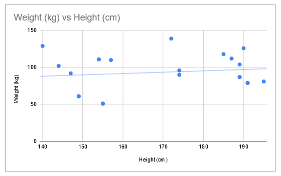
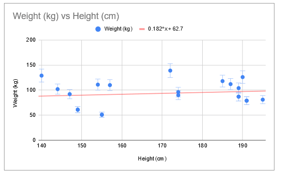
To understand how to make a Scatter plot on Google Sheets, we are going to use the height and weight data shown in the image below:
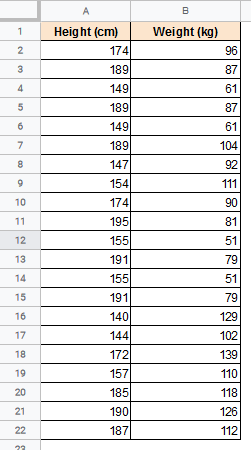
This dataset contains data on the height vs. weight of randomly selected men. We want to create a Scatter plot to understand how the two variables are related to one another.
To make the histogram for the above data, follow these steps:
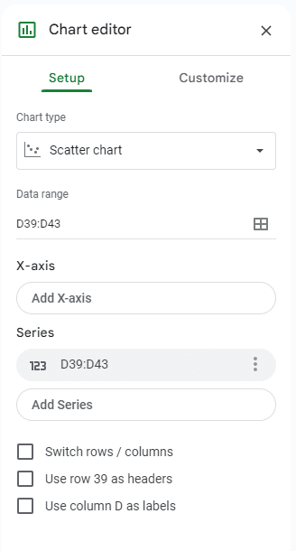
- Select the data you want to visualize in your scatter plot. You can also include the cells containing the column titles. In our example, let’s select the cell range A1:B22.
- Click the Insert menu from the menu bar.
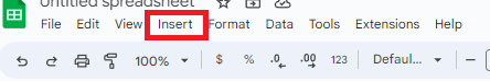
- Select the Chart option.
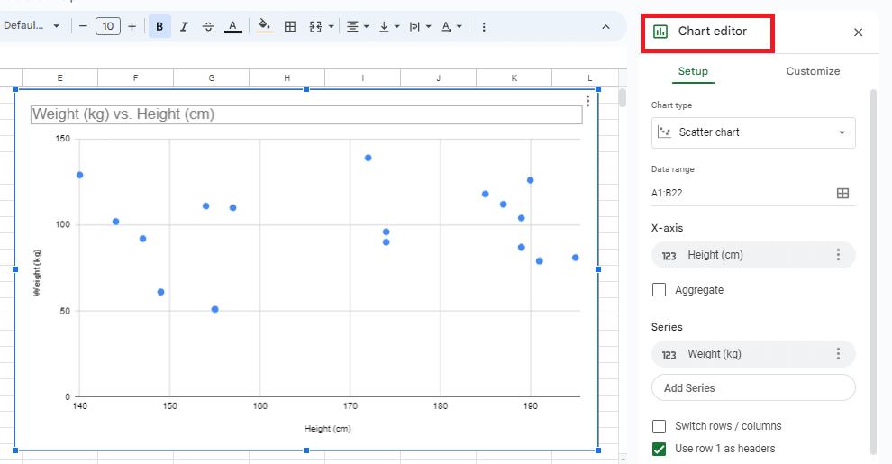
- This will display a chart on the worksheet and a Chart editor sidebar on the right side of the window.
- Google usually tries to understand your selected data and displays the chart it thinks is the best representation for it. Ideally, it should show a Scatter Chart. However, if you see some other kind of chart, go to step 6.
- Select the Setup tab from the Chart editor sidebar and click on the dropdown menu under “Chart type” to convert it to a Scatter Chart.
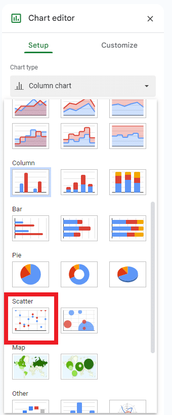
- From the chart options that you see, select the “Scatter chart”. It should be visible under either the “Suggested” or the “Other” category.
- You should now see a Scatter Plot on your worksheet.

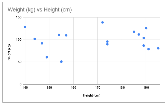
You can now see how the height-weight data points are distributed on a 2-dimensional space.
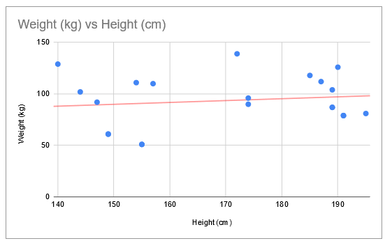
But just looking at points doesn’t really give much insight. So, you can look for patterns in your data by adding a trend line across the Scatter chart.
This will serve three purposes:
- You can see if there really is a strong correlation between height and weight. The closer the bulk of data points are to the straight line, the stronger the correlation.

- You can see trends in the data (if any), whether there is an upward or downward trend in weights as the heights increase.
- You can find out which data points are too far from the trendline and identify them as outliers.
There are plenty of other inferences that you can make from the scatter chart once you have a trend line calculated and displayed. In the same way it calculates compound interest, Google Sheets performs all the background calculations to give you the optimal trend line.
Adding a Trend Line
To add a trend line to your scatter chart, you will need to use the Chart Editor.
The Chart Editor is usually available as a side toolbar on Google Sheets when you create a chart. However, sometimes the Chart editor goes away after your chart has been created.
To make it appear again, do the following:
- Click on the graph.
- You should see an ellipsis (or hamburger icon) on the top right corner of the box containing the graph.

- Click on the ellipsis and select “Edit chart” from the drop-down menu.
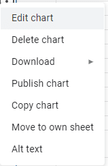
- This will make your Chart editor sidebar appear again.
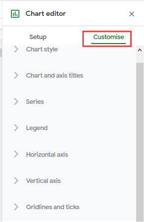
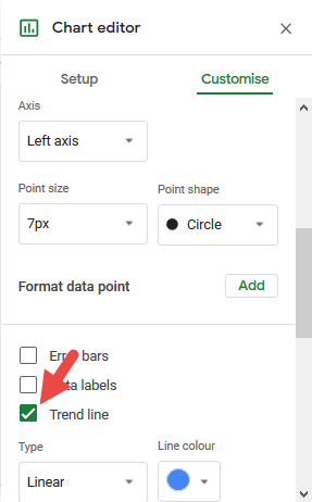
The Chart editor has a ‘Customize’ tab that lets you enter all the customization settings for your chart.
We are going to use this Customize tab to add a trend line to the scatter chart. Follow these steps:
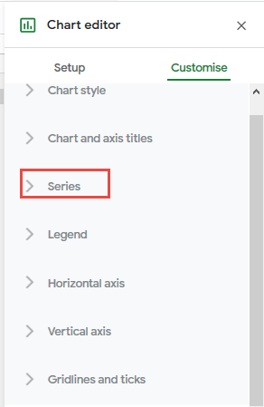
- Click on the Customize tab of the Chart Editor.

- Select the Series drop-down menu.
- Scroll down, and you should see three checkboxes – Error Bars, Data Labels, and ‘Trend line’
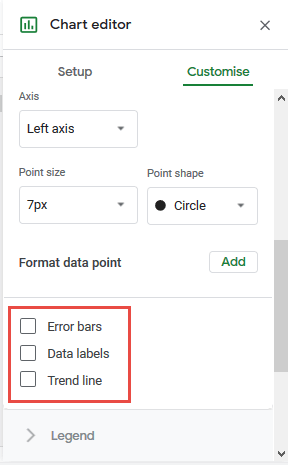
- Check the check box next to the ‘Trend line’.

You should now see a trend line displayed on your scatter chart.
Other Trend Line Options
Once you check the Trend line checkbox, you will notice a new set of related options under it. These options let you customize the trend line according to your requirement.
For example:
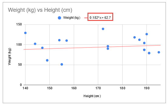
- You have the option to select the color that you want for your trend line. In our example, we set the trend line to red for contrast.
- You also have the option to set the thickness and opacity of the trend line.
- You can set the type of trend line you want. You have the option to insert a linear, exponential, polynomial, and moving average trend line, among others.
- You may get a different set of other options for each type of trend line that you choose.
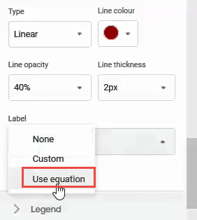
- Finally, the Label option is interesting. You can either set it to ‘none’ (in which case there will be no label), ‘custom’ (in which case you will get a customizable legend for the trend line or ‘Use equation’ (in which case you can display the equation for the trend line).

Using the trend line equation, you can easily extrapolate and find y-values for any selected point on the trend line, given an x-value (or vice-versa).
Customizing the Scatter Chart in Google Sheets
Besides adding a trend line, there are plenty of other customization options available for you to apply to your scatter chart. Here are some of the things that you can do:
Change the Chart Style
The Chart style category in the Chart editor lets you change the background color, border color, font style, and size of your chart.
Chart and Axis Titles
This category lets you provide the text and formatting for the chart title and subtitles, and axis titles.
Series: How to Use Error Bars in a Scatter Plot
The Series category lets you choose the colors for the points in the Scatter plot. This becomes even more helpful when you want to compare different variable distributions in one scatter chart from two or more sets of data.
You can also check the Error bars option to add error bars and see how reliable or ‘on-trend’ each data point is.
Legend
The Legend category, as its name suggests, lets you provide settings and formatting for the scatter chart legend.
Horizontal and Vertical Axes
You can use this category to:
- Change the text color of the entire chart
- Change the font for the horizontal and/or vertical axis.
- Set the font size for the x and/or y-axis values.
- Make the x and/or y-axis values bold and/or italicized.
- Display the x or y-axis as labels rather than numeric values.
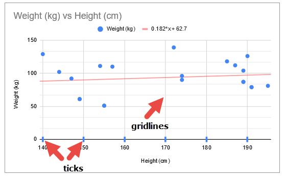
How to Do a Scatter Plot in Google Sheets with Different Gridlines and Ticks
This category lets you format the scatter chart to contain major and/or minor gridlines.
You can also set what colors you want the gridlines and ticks to be or choose not to have them at all.
How To Create a Scatter Plot In Google Sheets With Two Data Sets or Multiple Series
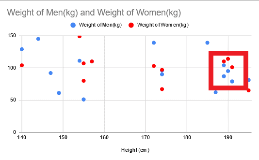
Say you wanted to alter the above results to include the distribution of different data sets for women and men instead of just general weight.
You don’t have to do anything special to include both data sets, you just have to highlight both when first making the chart. This is the same method when making a Google Sheets scatter plot with multiple series’ no matter how many. Yet, here’s some extra info on how to make a scatter plot in Google Sheets with two sets of data or more:
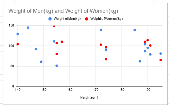
Keep in mind you couldn’t add a random second set of data as it has to be plottable on both axis to make sense. The above example works as both variables are measured in kg. It wouldn’t make a sensible graph to have a third measurement like foot size.
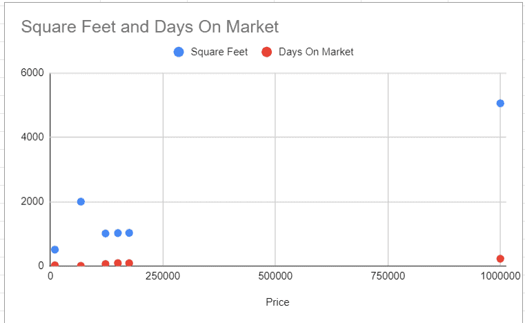
This can work with some variables to show the correlation between the two. But, in most cases, the results seem skewed. Below is an example of how different data sets may not give appropriate results. As you can see the ‘Days On Market” results are hardly recognizable.
How to Make a Scatter Plot in Google Sheets: Interpreting Data
Using Google Sheets scatter plots makes it easy to identify groupings for data points as they will be close together. As an example, you can see where most data points lie highlighted in the image below.
It’s also much easier to see outliers than other graph types.
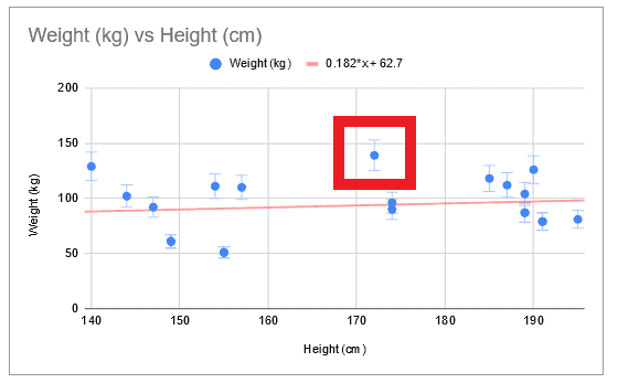
If you also use error bars, it’s simple to see which data points have the largest margin of error within them. In the example below, you can see that the highlighted data points has a larger margin of error than the others.
Frequently Asked Questions
Stil have some questions about our scatter plot Google Sheets guide? Check out these FAQs, or let us know in the comments if you need any extra help.
How Do You Connect Scatter Plot Dots in Google Sheets?
You can’t! Scatter plots are not designed to have their points connected. If you have data that needs to be shown as a continuous line, use a line graph instead. Or even a bar graph with a line over the top.
How Do You Make a Line of Best Fit on a Scatter Plot in Google Sheets?
A line of best fit is also known as a trend line. There are a few steps and options to creating one. To avoid repeating ourselves, scroll back up to the Adding a Trend Line subheading.
How Do You Make a Smooth Scatter Plot in Google Sheets?
Unfortunately, you can only add a straight trendline to a scatter plot in Google Sheets.
How Do I Plot Points in Google Sheets?
- Select the data you want to make the plot graph from
- Navigate to Insert > Chart
- Change the Chart type to Scatter chart
How Do You Connect Scatter Plot Points in Google Sheets? / Is There a Way to Connect Scatter Plot Dots in Google Sheets?
Scatter plots shouldn’t be joined. Instead, you may want to make a line graph or perhaps a line of best fit.
How Do You Make a Scatter Plot in Google Sheets With Two Sets of Data?
If you already know how to graph a scatter plot on Google Sheets, it’s easy! Providing that both sets of data are able to be plotted on the same planes, you just have to highlight both sets when you first build the chart. Sheets will do the rest for you.
What Do 95% Error Bars Mean?
A 95% error bar means that there is only a 5% chance that the plotted point is not actually within that range.
Wrapping up How to Make a Scatter Plot in a Google Spreadsheet
In this tutorial, we demonstrated how to make a scatter plot in Google Sheets and add a trendline in the scatter chart to draw valid inferences from your data.
I hope you enjoy creating and enhancing your scatter charts on Google Sheets and have fun exploring your data.
Other Google Sheet tutorials you may like: