Google Sheets doesn’t have a native Gantt chart feature. There are two ways to get one: copy a spreadsheet template, or build it from a stacked bar chart. Both work, and both are below.
If you just need a working Gantt chart for a project you’re planning today, use the template. If you want to understand how it works so you can customize it, follow the build-from-scratch walkthrough.
Which method should you use?
| Method | Time required | Customization | Best for |
|---|---|---|---|
| Copy our template | 2 minutes | High | Most people. Start here. |
| Stacked bar chart workaround | 10 minutes | Medium | Readers who prefer a chart object over a formatted grid. |
| Build from scratch | 30 to 45 minutes | Full | Custom layouts, teaching yourself the formulas, or building a reusable template. |
Download the free Google Sheets Gantt chart template
Click the link and select Make a copy when Google Sheets prompts you. That gives you your own editable version.
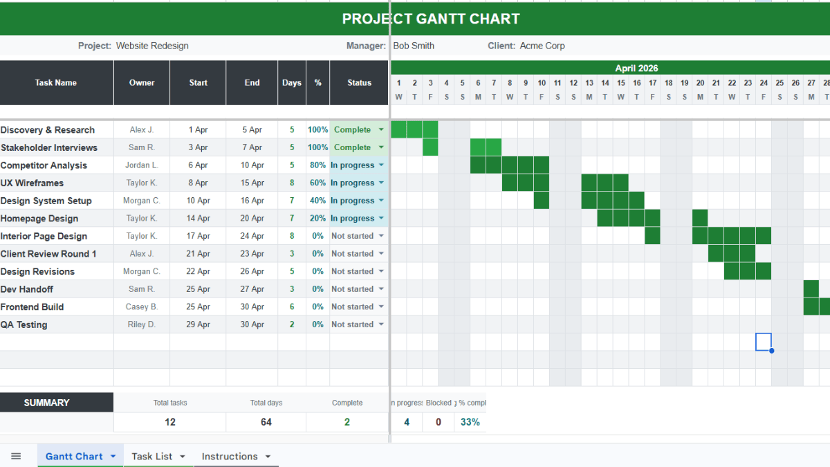
The template has two tabs. The main tab is the Gantt chart itself. Enter your task name, start date, end date, and owner, and the timeline bars render automatically. You can use categories, task names, etc. Once you have the template, it’s easy to customize for your own project timeline and specifications.
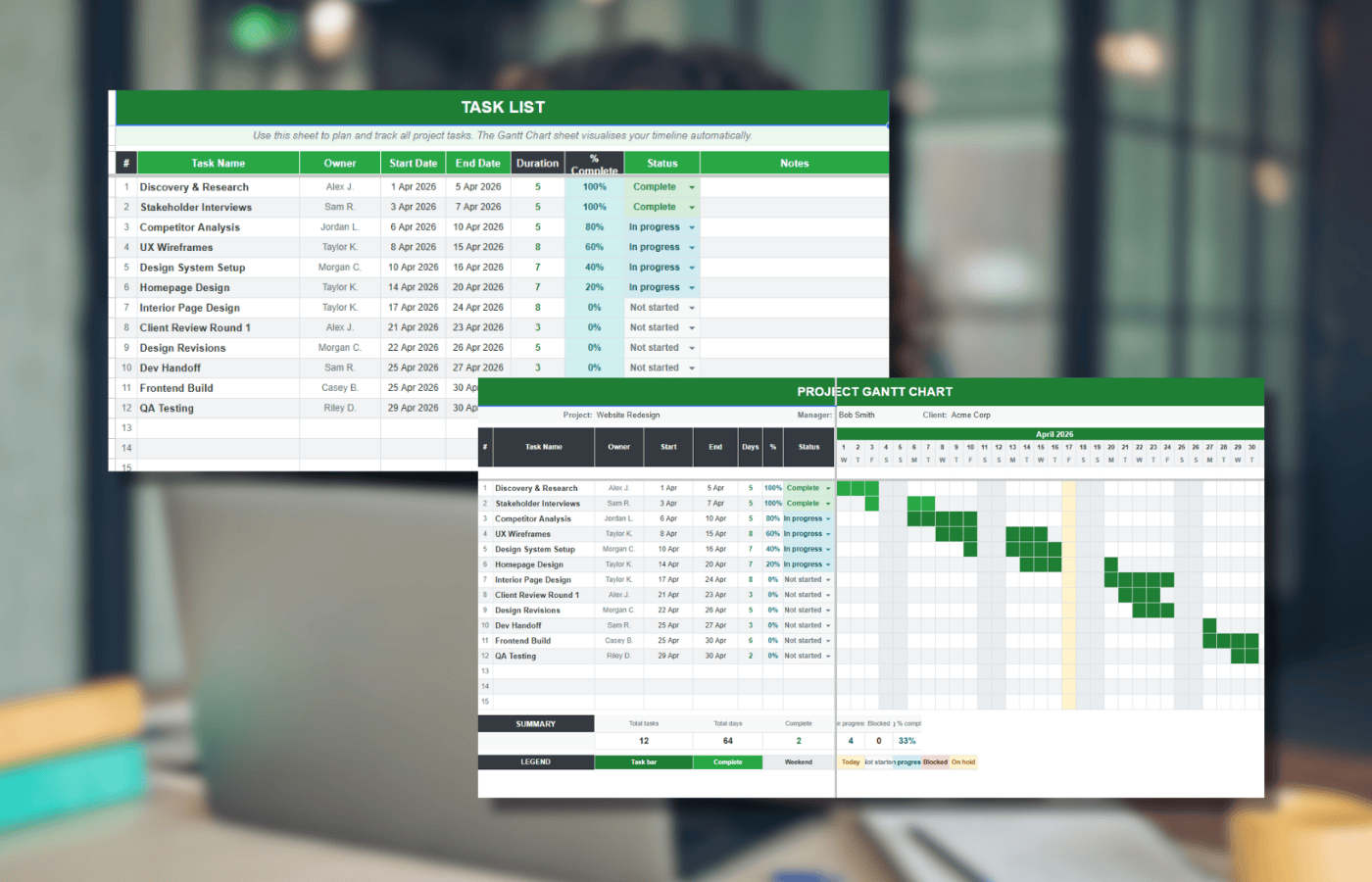
The second tab holds the project details and dependencies. You can edit both tabs without breaking the formulas.
If the template covers what you need, stop here. If you want to understand how the conditional formatting drives the bars, keep reading.
What a Gantt chart is and when to use one
A Gantt chart turns a project schedule into a horizontal timeline. Each task is a bar. The position shows the start date, the length shows the duration.
At a glance, a Gantt chart shows the tasks in the project, the duration of each, where tasks overlap, and the minimum time to deliver. It also makes the critical path visible, the sequence of tasks that has to finish on time for the project to finish on time.
Gantt charts work well for projects with fewer than thirty or so tasks and simple dependencies. Past that, move to dedicated project management software. Sheets starts to strain when you need multi-level dependencies, resource allocation, or real-time updates from a team.
Method 1: Make a simple Gantt chart with a stacked bar chart
Google Sheets stacked bar charts don’t plot from a start date, they plot from zero. The workaround is to build a second table that calculates how many days each task starts after the project start, then hide the first segment of each bar. That leaves a bar that looks like a Gantt timeline.
Step 1: Enter the project schedule
Set up three columns: Task Name, Starting Date, Ending Date.

Fill in your tasks. If you just want to follow along, use these sample tasks:

Step 2: Build the calculation table
Below your first table, create a second table with three columns: Task Name, Start Day, Duration. Copy the same task names into the new table.

In the first Start Day cell (B8 in the example), enter:
=INT(B2)-INT($B$2)
Drag the formula down through the rest of the column. This gives you how many days after the project start each task begins.

In the first Duration cell (C8), enter:
=C2-B2
Drag the formula down. This calculates how long each task runs.

Step 3: Insert the stacked bar chart
Select the second table (A7:C11 in the example). Go to Insert > Chart.

Sheets usually picks a stacked bar chart automatically. If it picks something else, open the Chart editor on the right and set Chart Type to Stacked bar chart.

You’ll see two segments on each bar: Start day in blue, Duration in red.

Step 4: Hide the start day segments
Double-click any blue Start day bar. All the Start day segments highlight.

In the Chart editor, go to the Customize tab.

Under Series, make sure Start day is selected in the dropdown.

Set Fill opacity to 0%. The start day segments go invisible.

The chart now looks like a Gantt timeline.

Remove the chart legend
The Start day / Duration legend isn’t useful anymore. To remove it:
- In the Chart editor, go to Customize > Legend.
- Set Position to None.

Method 2: Build a Gantt chart from scratch with conditional formatting
The stacked bar chart method gives you a chart object. The method below gives you a full Gantt grid with task owners, percent-complete tracking, weekend highlights, and automatic timeline bars driven by conditional formatting. It’s what’s inside the template at the top of this page.
Too long? Copy the template. Everything below is how it’s built.
Formula quick reference
These are the five formulas the template uses. Each one is explained in the steps below.
| Purpose | Formula |
|---|---|
| Duration in days | =INT(E10)-INT(D10)+1 |
| First day of the project month | =EOMONTH(D10,-1)+1 |
| Sequential days across the row | =H8+1 |
| Day of week (first letter) | =LEFT(TEXT(H8,"ddd"),1) |
| Gantt bar conditional format | =AND(H$8>=$D10,H$8<=$E10) |
Step 1: Set up the outline
Create the skeleton: a header block for project title, manager, and company, a task table with columns for task name, owner, start date, end date, duration, and percent complete, and a date grid across the top with two rows, one for dates and one for days of the week.

Step 2: Add the duration formula
In the first duration cell (F10):
=INT(E10)-INT(D10)+1
Drag it down through the rest of the duration column.

Step 3: Add color scale formatting to the percent complete column
The percent complete column fills darker as the task progresses. 0% is white, 100% is green.
- Select the cells in column G, starting from G10.
- Go to Format > Conditional formatting.
- In the sidebar, select the Color scale tab.
- Click the preview bar and pick the white-to-green scale.
- Set Minpoint, Midpoint, and Maxpoint to Percent.
- Click Done.


Enter a few percentages to see the fill color change.

Step 4: Fill in the sequence of days
The date row should start on the first day of the project month. If the first task starts 3/12/2026, the date row starts 3/1/2026.
In the first cell of the date row (H8):
=EOMONTH(D10,-1)+1
EOMONTH with -1 returns the last day of the previous month. Adding 1 gives you the first day of the current month.
The result is a full date, but you want just the day number. Select H8 and go to Format > Number > More formats > Custom number format. Enter d and click Apply.


For the rest of the row, in cell I8:
=H8+1
Drag it right across the row. Each cell adds one day.

Step 5: Add the day-of-week row
Below the date row, add a single letter for each day of the week. In H9:
=LEFT(TEXT(H8,"ddd"),1)
TEXT converts the date in H8 to a three-letter day name (“Mon”). LEFT grabs the first letter (“M”). If D10 is 3/12/2026, H8 is 3/1/2026, which is a Sunday, so H9 returns “S”.
Drag right across the row.

Step 6: Highlight the weekend columns
Use conditional formatting to shade weekends light blue.
- Select the full Gantt grid (H10:BR22 in the example).
- Go to Format > Conditional formatting.
- In the sidebar, set Format cells if… to Custom formula is.
- Enter:
=H$9="S" - Set the fill color to light blue.
- Click Done.


Every column where row 9 is “S” (Saturday or Sunday) fills light blue.

Why the formula works
The formula =H$9="S" checks the corresponding cell in row 9 for the letter S. Both Saturday and Sunday start with S, so both weekend columns match. The dollar sign locks row 9 but lets the column shift as the rule applies across the grid.
Step 7: Draw the Gantt bars with conditional formatting
Now add a second conditional formatting rule that fills each cell dark blue when the date in that column falls between the task’s start and end dates.
- Select the full Gantt grid again (H10:BR22).
- Go to Format > Conditional formatting.
- Click Add another rule.
- Set Format cells if… to Custom formula is.
- Enter:
=AND(H$8>=$D10,H$8<=$E10) - Set the fill color to dark blue.
- Click Done.


The Gantt bars draw automatically for every task based on the start and end dates in columns D and E.

Step 8: Layer the Gantt bars on top of the weekend highlights
If the weekend rule runs first, the weekend cells stay light blue even when a task spans them. You want the dark blue bars on top.

Click into the Gantt grid to open the Conditional format rules sidebar. You’ll see both rules listed, weekend first, Gantt bars second.

Hover over the Gantt bar rule until three vertical dots appear on the left. Drag it above the weekend rule.

The bars now render on top.

Why the formula works
The formula =AND(H$8>=$D10,H$8<=$E10) checks two conditions: the date in row 8 is on or after the task’s start date, and it’s on or before the task’s end date. If both are true, the cell fills dark blue.
Row 8 is locked with H$8, and the task’s start and end columns are locked with $D10 and $E10. That lets the rule apply across the whole grid without breaking.
Add task dependencies
Real projects have tasks that depend on other tasks. Sheets can handle simple dependencies with the MAX function, and the dates update automatically when a dependent task shifts.
Make a task start after another finishes
If Task 2 can’t start until Task 1 finishes:
- Click the start date cell for Task 2 (B3).
- Type
=MAX( - Click the end date cell for Task 1 (C2).
- Press Enter.


Now when Task 1’s end date moves, Task 2’s start date moves with it.
Make two tasks start at the same time
If Task 3 has to start when Task 2 starts:
- Click the start date cell for Task 3.
- Type
=MAX( - Click the start date cell for Task 2 (B3).
- Press Enter.

Dependencies chain. If B3 depends on C2, and B4 depends on B3, then B4 is also pegged to C2. Move Task 1’s end date, and everything downstream updates.
Add milestones
Milestones are zero-duration markers for key project events like a kickoff, a review gate, or a launch date. To show milestones on the Gantt chart:
- Add the milestone as a task row with the same start and end date.
- Add a third conditional formatting rule on the Gantt grid.
- Use the custom formula
=AND(H$8=$D10,$D10=$E10) - Set the fill color to something that stands out (orange or red works well).
The rule only fires when start date equals end date and the column date matches, so regular tasks aren’t affected.
Share the Gantt chart with your team
Click the blue Share button in the top right of Google Sheets, enter email addresses, and set permission to Editor or Viewer. Editors can update task status and dates, and the Gantt bars redraw for everyone the moment the sheet recalculates.
This is the main reason to build a Gantt chart in Sheets instead of a desktop tool. Everyone sees the current state of the project without anyone having to export, send, or sync anything.
Export to Excel
The Gantt chart works in Excel with only minor formatting touch-ups. To export:
- Go to File > Download.
- Select Microsoft Excel (.xlsx).
- Open the downloaded file in Excel.
Conditional formatting rules and formulas come across intact. The chart object from the stacked bar method also transfers.
When a Gantt chart in Sheets isn’t the right tool
Google Sheets Gantt charts are fine for most projects. Past roughly thirty tasks, or when you need multi-level dependencies, resource allocation, or critical path analysis, move to dedicated project management software. Sheets starts to feel slow, and maintenance eats the time savings.
The template is still a good starting point for scoping a project before you decide whether you need the heavier tool.
Frequently asked questions
Does Google Sheets have a built-in Gantt chart feature?
No. Google Sheets doesn’t have a native Gantt chart. The two workarounds are a stacked bar chart with hidden start-day segments, or a formatted grid using conditional formatting. The template at the top of this article uses the second method.
How do I add dependencies to a Google Sheets Gantt chart?
Use the MAX function to link a task’s start date to another task’s end date. In the start date cell, enter =MAX( then click the end date cell of the task it depends on. When the upstream task shifts, the dependent task’s dates update automatically.
Can I convert my Google Sheets Gantt chart to Excel?
Yes. Go to File > Download > Microsoft Excel (.xlsx). The conditional formatting rules, formulas, and chart objects all transfer. You may need to adjust column widths or colors in Excel.
How do I show percent complete on a Gantt chart in Google Sheets?
The template uses a color scale on the percent complete column, white at 0% and green at 100%. Apply conditional formatting with a color scale and set the minpoint, midpoint, and maxpoint to Percent. To show progress on the bars themselves, add a third conditional formatting layer that fills a different color when the column date is before today.
What’s the difference between a Gantt chart and a timeline in Google Sheets?
A Gantt chart shows task durations as horizontal bars across a date grid. A timeline shows events as points on a single horizontal line. Use a Gantt chart for projects with overlapping tasks. Use a timeline for chronological event lists.
Can I share a Google Sheets Gantt chart with my team?
Yes. Click the Share button, enter email addresses, and set permission to Editor or Viewer. The Gantt bars recalculate live for everyone when task dates change.
How do I add milestones to a Gantt chart in Google Sheets?
Add a task row with the same start and end date, then create a third conditional formatting rule using =AND(H$8=$D10,$D10=$E10) and a distinct color. The rule only fires on zero-duration tasks, so regular bars aren’t affected.
Why is my Gantt chart not showing all the days in the month?
The date row only extends as far as you dragged the =H8+1 formula. Drag it further to cover the full project range. If the bars still don’t render past a certain column, check that the Gantt conditional formatting rule’s range covers those columns too.
More Google Sheets project templates
- Google Sheets project management template: a hub with Gantt, timeline, tracker, and budget views
- How to make a timeline in Google Sheets
- Google Sheets calendar templates, including a Gantt variant
- Google Sheets charts guide
- How to copy conditional formatting in Google Sheets
- Color scale conditional formatting in Google Sheets
- How to make a bar graph in Google Sheets
Template or build, pick one
Copy the template and you have a Gantt chart in two minutes. Build it from scratch and you understand every formula well enough to modify it. Both paths end in the same place, a Google Sheet that shows your project schedule and updates itself when the dates change.