A Game-Changing Function for Single-Cell Data Visualization

The Sparkline function, often overlooked by casual users, is redefining how trends and patterns can be represented within spreadsheets.
The Sparkline function, often overlooked by casual users, is redefining how trends and patterns can be represented within spreadsheets.

Stacked bar charts have a specific function. They’re the best-possible way to visualize data in these situations.

How to Indent on the Google Docs App: Select the text or paragraph you want to indent. Tap the “A” (Format) icon in the top-right corner of the screen. Tap the “Paragraph” tab in the formatting menu. Tap the “Right Indent” icon to increase the indent level. Repeat as needed to achieve your desired formatting. … Read more
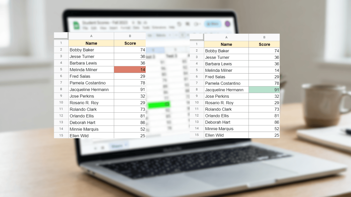
Use Conditional Formatting in Google Sheets to automatically highlight the highest or lowest value in any dataset with no manual scanning required. This tutorial covers max, min, top N, bottom N, and full-row highlighting with simple custom formulas.

Learn how to insert an image in a cell in Google Sheets. This guide shows each step with photos, videos, and detailed instructions.

Change your Google Sheets row height with these four simple methods. Includes detailed walkthroughs on resizing and setting to exact pixels.