Quick Actions
Don’t want to build one from scratch? Skip ahead:
Excel dashboards are a great way to present vital data at a glance while offering incredible technology and user interactivity. Whether you are tracking sales KPIs or managing project timelines, a well-built dashboard turns raw numbers into decisions.
This Excel dashboard tutorial will show you the step-by-step process of building one. We’ve also included some templates to help kickstart the process for you.
What Is an Excel Dashboard?
A Microsoft Excel dashboard is a single-screen interface that consolidates your most important data metrics. It serves as a visual snapshot of performance, allowing managers and stakeholders to spot trends without digging through thousands of rows of data.
Key Components of a Dashboard
A professional dashboard is more than just a few charts pasted together in an Excel file. It typically includes:
| Component | Function |
|---|---|
| KPIs | High-level metrics like Total Revenue, Net Profit, or Active Users. (See our Profit and Loss templates for examples). |
| Charts & Graphs | Visualizations (Bar, Line, Pie) that show trends over time. |
| Slicers | Interactive buttons that let users filter data by Region, Year, or Product instantly. |
| Data Tables | Detailed grids for users who need to see exact figures behind the visuals. |
Related: Excel vs. Google Sheets: Which is Better for Dashboards?
How To Create A Dashboard In Excel (Step-by-Step)
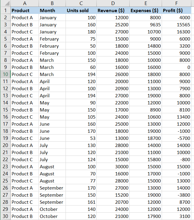
Creating dashboards in Excel bridges raw data and actionable insights. We’ll be using example sales data to build a dynamic report.
Pro Tip: Clean Data Automatically with Power Query
Before you build charts, you need clean data. If you find yourself manually deleting rows or fixing date formats every week, use Power Query.
What is Power Query? It is an Excel tool that records your data cleanup steps and replays them automatically. Instead of fixing a messy CSV file every Monday, you just click “Refresh.”
- Go to Data > Get Data.
- Select your source (File, Web, or Table).
- Use the Power Query Editor to remove errors, split columns, or filter rows.
- Click Close & Load to send the clean data to your dashboard source table.
Step 1: Convert Data to a Table
Before analyzing, ensure your data is formatted as an official Excel Table. This ensures that if you add new sales later, your dashboard updates automatically.
- Select your data range.
- Press Ctrl + T (or go to Insert > Table).
- Ensure “My table has headers” is checked and click OK.
Step 2: Summarize with Pivot Tables
You cannot chart 10,000 rows directly. You must summarize them first.
- Go to Insert > PivotTable.
- Choose “New Worksheet”.
- Drag fields (like “Product”) to Rows and metrics (like “Revenue”) to Values.

Pro Tip: If you need to track specific project statuses, check out our Project Status Report Template for ideas on what fields to summarize.
Step 3: Create Visuals (Pivot Charts)
- Click anywhere inside your Pivot Table.
- Go to Insert > PivotChart.
- Select a chart type (e.g., Clustered Column).
- Cut (Ctrl+X) the chart and Paste (Ctrl+V) it onto a new sheet named “Dashboard”.
Spotlight: The Clustered Column Chart
For dashboards comparing multiple categories side-by-side (e.g., Sales by Region for Q1 vs Q2), the Clustered Column Chart is the industry standard.
When to use it:
- Comparing values across few categories (2-4 series).
- Showing performance against a target (e.g., Actual vs. Budget).
How to create it:
- Highlight your Pivot Table data.
- Go to Insert > Insert Column or Bar Chart.
- Select Clustered Column (the first option under 2-D Column).
Step 4: Add Interactive Features with Slicers
This is what makes a dashboard “dynamic” rather than static.
- Click on your Pivot Chart.
- Go to the Analyze tab in the ribbon.
- Click Insert Slicer.
- Choose a dimension (e.g., “Year” or “Region”).

Turning the Dashboard into Analysis
A pretty and dynamic dashboard is useless if it doesn’t answer questions. Once your charts are live, use Excel’s analysis features to dig deeper.
- Trendlines: Right-click a data series in your line chart and select “Add Trendline.” This mathematically calculates if your metrics are trending up or down, filtering out daily noise.
- Calculated Fields: In your Pivot Table, go to Analyze > Fields, Items, & Sets > Calculated Field. Use this to create custom metrics like “Average Profit Margin” that don’t exist in your raw data.
- Conditional Formatting: Apply this to your data tables to instantly highlight outliers. For example, set a rule to turn any cell red if “Profit” drops below 10%.
Step 5: Formatting & Layout
Arrange your charts logically. Group related metrics together (e.g., all Finance charts on the left, all Operations charts on the right). Use a consistent color scheme to make it look professional.
Free Excel Dashboard Templates
Building from scratch is great for learning, but sometimes you just need to get the job done. Download our ready-to-use templates below.
1. Simple Sales Dashboard
A clean, blue-themed dashboard perfect for tracking monthly sales performance. Includes slicers for product category filtering. This tracks key metrics for for anyone in business development.

2. Financial Performance Dashboard
An advanced dashboard featuring custom gauges and trendlines. Ideal for tracking revenue vs. expenses. This is an interactive dashboard with powerful real-time analytics. It’s versatile and can be used in various industries, regardless of data sources.
Financial dashboards like this one help different people from different departments align their goals. It’s key for data analysis.

Need a fresh start? You can also grab our Blank Spreadsheet Template to build your own custom layout.
Dashboard vs. Report: What’s the Difference?
Many people use the terms interchangeably, but they serve different purposes. Here is a quick breakdown:
| Excel Dashboard | Excel Report |
|---|---|
| Quick overview; “At a glance” monitoring. | Deep dive; Detailed analysis. |
| High (Slicers, Dynamic Charts). | Low (Static Tables, Text). |
| Single Screen (One Sheet). | Multi-page (Multiple Tabs or Printouts). |
Frequently Asked Questions
How often should I update my dashboard?
Ideally, your dashboard should update automatically. By using Excel Tables (Step 1), any new data added to the bottom of your list will automatically be included in your Pivot Tables once you click “Refresh All.” For inventory tracking, check out our Reseller Inventory Template which handles updates seamlessly.
Are these templates free?
Yes, the templates linked above are 100% free. If you need more specialized tools, such as for tracking assignments or schedules, visit our full Assignment Tracking Templates page.
Bottom Line
Mastering Excel dashboards is a superpower in the business world. Whether you use our free templates or build a custom one using the steps above, visualizing your data is the first step toward better decision-making.
Ready to level up? Check out our Premium Template Library for advanced tools. Use code “SSP” for 50% off!
Related Guides: