Most KPI tracking falls apart in one of two places. Either the data lives in ten different places and nobody trusts any of it, or everything ends up in a spreadsheet that looks fine until someone actually has to update it.
This free KPI dashboard for Microsoft Excel and Google Sheets fixes both problems. You enter your targets and actuals in the data log tab of the spreadsheet, and the dashboard updates automatically. Status is color-coded. Category breakdowns calculate on their own. There’s nothing to format, no formulas to build, and no pivot tables to maintain.
Get your copy below, or keep reading to see exactly what it does and how to use it.
What is a KPI dashboard template?
A KPI dashboard template is a pre-built spreadsheet that tracks key performance indicators across your business. You enter the key metrics that matter to you, set targets, and record actuals. The template handles the math and the visuals.
The alternative is building one from scratch. That usually means spending two hours on formatting, another hour debugging formulas, and then realizing the layout does not actually show what you need. A template skips all of that.
This one is designed as a template for Google Sheets, which means it is free, shareable, and accessible from anywhere. It also means, once you make your copy, you can download it as an xls file for Excel.
What this KPI dashboard template includes
The KPI template has three tabs: KPI Dashboard, KPI Data Log, and Instructions. You can also adjust the template to your own goals such and workflows. Personalize it with sales data for an active outbound sales team or update with project goals for a busy dev team. It’s built for flexibility (which is one of the main reasons we share these in Google Sheets).
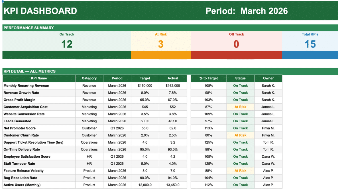
KPI Dashboard tab
This is the view you share. There’s no manual dashboard creation. Instead, the dashboard tab pulls everything from the data log automatically and organizes it into three sections.
At the top, a summary scorecard shows how many KPIs are On Track, At Risk, or Off Track at a glance. Below that, a full detail table lists every KPI with its category, period, target, actual, percentage to target, status, and owner. At the bottom, a category breakdown shows performance by department: Revenue, Marketing, Operations, Customer, HR, and Product.
Every number on this tab is a formula. Nothing needs to be updated manually.
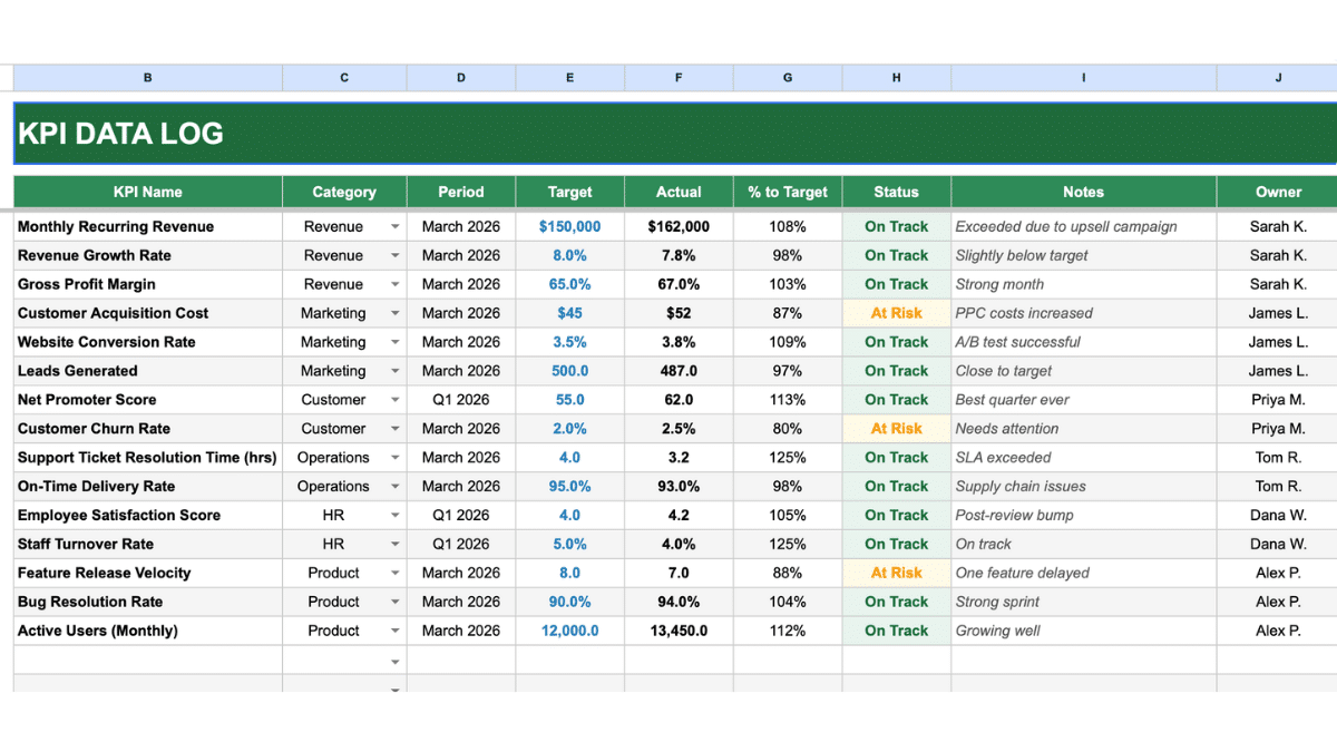
KPI Data Log tab
This is where you enter data. The log has columns for KPI name, category, period, target, actual, notes, and owner. Two columns calculate automatically: percentage to target and status.
Status uses three thresholds. At 95% of target or above, a KPI is On Track. Between 80% and 94%, it is At Risk. Below 80%, it is Off Track. The cells turn green, amber, or red accordingly.
The template also handles KPIs where lower is better. Churn rate, cost per acquisition, and resolution time all work correctly out of the box. The percentage to target formula inverts for those metrics automatically.
The category column has a dropdown built in. Click any cell in that column to select from the six preset categories.
Instructions tab
A plain-language guide to setting up and using the template. It covers how to enter KPIs, what each status threshold means, how to track multiple months, and how to expand the template beyond the default 46-KPI limit.
How to use this simple KPI dashboard template
Step 1: Enter your KPIs
Go to the KPI Data Log tab. The template comes pre-loaded with 15 sample KPIs across all six categories. You can replace them, add to them, or delete what does not apply.
In column B, enter the KPI name. Keep it specific enough that anyone reading the dashboard will know what they are looking at.
Step 2: Assign a category and period
Use the dropdown in column C to assign each KPI to a category. In column D, enter the time period you are tracking. This can be a month (March 2026), a quarter (Q1 2026), or any other format that makes sense for your reporting cycle.
Step 3: Enter target and actual
Column E is your target. Column F is your actual result. Enter numbers only. For percentages, enter as decimals: 8% is 0.08, not 8.
The percentage to target and status columns will update the moment you enter both values. You do not need to do anything else.
Step 4: Add notes and owner
Column I is for context. If a KPI missed target because of a one-time event, note it here. Column J is the owner, the person or team responsible for that metric.
With owners assigned, the dashboard becomes a useful tool for team reviews, not just a personal tracking sheet.
Step 5: Check the dashboard
Switch to the KPI Dashboard tab. Everything updates automatically. The scorecard at the top shows your current totals. The detail table shows every KPI. The category breakdown at the bottom shows how each department is performing overall.
KPI examples by category
If you are not sure which KPIs to track, here are common options for each of the six categories in the template.
Revenue
Monthly recurring revenue, revenue growth rate, gross profit margin, average deal size, and revenue per customer are the most commonly tracked. For smaller businesses, total monthly revenue and revenue versus the same period last year cover most of what you need.
Marketing
Leads generated, cost per lead, website conversion rate, email open rate, and customer acquisition cost. If you run paid advertising, cost per click and return on ad spend belong here too.
Operations
On-time delivery rate, support ticket resolution time, defect rate, and fulfillment accuracy. For service businesses, average response time and SLA compliance are the ones that matter most.
Customer
Net Promoter Score, customer satisfaction score, churn rate, and customer lifetime value. Churn is the one most businesses should track but often do not until it is already a problem.
HR
Employee satisfaction score, staff turnover rate, time to hire, and absenteeism rate. For smaller teams, a quarterly satisfaction survey and turnover rate are usually enough.
Product
Active monthly users, feature release velocity, bug resolution rate, and user retention. If you run a SaaS product, daily active users and trial-to-paid conversion rate are worth adding.
How to track KPIs over multiple months
The simplest approach is to duplicate the KPI Data Log tab each month and rename it. Keep March 2026, April 2026, and May 2026 as separate tabs. The KPI Dashboard tab can then be pointed at whichever month you want to review by updating the formula references.
For a longer view of trends, a separate month-by-month summary tab works well. Enter each month’s On Track count and total KPIs, then add a simple chart to visualize the direction. The project management template shows one way to structure ongoing tracking like this if you want a reference.
KPI dashboard vs. OKR tracker
These two tools are related but they serve different purposes. An OKR tracker captures objectives and the key results you are using to measure progress toward them. It operates at a strategic level. A KPI dashboard tracks the ongoing operational metrics that tell you whether the business is healthy right now.
In practice, many teams use both. OKRs define what you are trying to achieve in a quarter. KPIs tell you whether day-to-day performance is on track to get there. The two tools complement each other rather than replace each other.
When to use a spreadsheet and when to use dedicated software
Google Sheets handles KPI tracking well for teams under about 20 people, or for businesses that review metrics monthly rather than in real time. It is free, shareable, and flexible. Anyone can open it without signing up for anything.
Dedicated BI tools like Looker Studio or Power BI make sense when your data lives in multiple systems and needs to be pulled together automatically, when you need real-time updates, or when you have more metrics than a spreadsheet can comfortably display. They come with a learning curve and usually a cost.
For most small businesses and teams, a well-structured Google Sheets dashboard is the right starting point. You can always graduate to something more powerful once you know which metrics actually matter. The Google Sheets dashboard guide covers how to build more advanced setups if you outgrow this template.
Frequently Asked Questions
Can I add more KPIs beyond the default 46?
Yes. The KPI template supports up to 46 KPIs in rows 5 through 50 of the KPI Data Log. To add more, simply enter data in the next empty row. You will also need to extend the formulas on the KPI Dashboard tab to include the new rows. Select the formula cells in the detail table, then drag them down to cover the additional rows.
Can I add custom categories instead of the six presets?
Yes. Select cells C5 through C100 in the KPI Data Log, go to Data, then Data Validation, and edit the list values to include your own categories. Update the category breakdown table on the dashboard tab to match.
How does the template handle KPIs where lower is better?
For metrics like churn rate, cost per acquisition, and support resolution time, a lower actual is a better result. The template includes inverted percentage-to-target formulas for these KPIs so that a lower actual still scores as On Track. The sample data includes examples of this in action.
Can I use this template in Excel instead of Google Sheets?
Yes. The template is built in Excel-compatible format and will open in Excel without issues. Conditional formatting, dropdowns, and formulas all work the same way. To use it in Google Sheets, upload the file to Google Drive and choose to open it as a Google Sheet.
How often should I update a KPI dashboard?
It depends on the KPI. Revenue and operational metrics are often reviewed weekly or monthly. Customer satisfaction scores and HR metrics may only update quarterly. The template supports any cadence because you define the period for each KPI individually. A monthly review rhythm works well for most small business teams.
Can I track KPIs for multiple departments on one dashboard?
Yes. That is exactly what the category breakdown section is designed for. Revenue, Marketing, Operations, Customer, HR, and Product are all tracked separately in the category table at the bottom of the dashboard. Each department gets its own On Track count and percentage.
What is the difference between a KPI and a metric?
All KPIs are metrics, but not all metrics are KPIs. A metric is any number you track. A KPI is a metric that is directly tied to a strategic goal and has a target attached to it. Page views are a metric. Page views with a monthly target of 50,000 that feeds into a revenue goal is a KPI.