We did what a lot of people do at first. We tried to “eat healthy,” guessed at portions, and hoped the scale would move. Some weeks it did, some weeks it did not, and we had no idea why. Eventually, the frustration got high enough that we decided to treat weight loss the same way we treat work projects: with data, not vibes.
That is where two tools changed everything for us. The first was TDEE, a single number that tells you roughly how many calories you burn each day. The second was a simple Google Sheets file that tracked what we actually ate. Once we combined those two, weight loss stopped feeling mysterious and started looking like a spreadsheet problem.
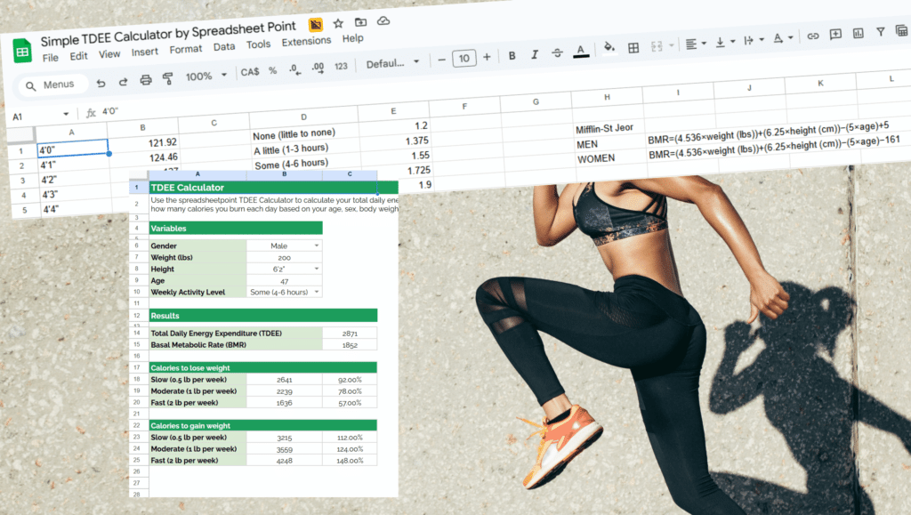
TDEE stands for Total Daily Energy Expenditure. It is an estimate of how many calories your body uses in a day based on your age, size, sex, and activity level. If you consistently eat around your TDEE, your weight usually stays about the same.
Eat above it, and you gain over time. Eat below it and, slowly, you lose.
We began thinking of TDEE like a monthly paycheck and calories like spending. If your TDEE is income, all your favorite foods (including snacks and desserts) are line items. Once we framed it this way, the goal was as simple as budgeting.
There are plenty of calculators online that will ask for your age, height, weight, and activity level, then spit out an estimate for your TDEE. We picked a reasonable activity level, wrote the number down, and treated it as a starting point. If the scale did not move for a few weeks, we nudged the number down a little.
Next, we opened a blank Google Sheet and built the most basic log we could imagine. One row per day. Columns for breakfast, lunch, dinner, snacks, total calories, and a simple note column for anything unusual like special events or sickness.
If you do not want to build it from scratch, you can start with a ready-made calorie-tracker spreadsheet template. Just adjust the columns to match how you like to eat.
Under the total calories column, we added a “budget remaining” cell that took our TDEE, subtracted the day’s total, and showed whether we were in a deficit or surplus. That one number was more helpful than any color-coded app. On days with a deficit, we knew we were moving in the right direction. On days with a surplus, we could see how large it really was instead of just feeling like we messed up.
Calories are only half the story. To see whether the math matched real life, we added another tab where we logged our morning weight a few times a week. Over time, that tab began to look like a gentle trend line instead of a roller coaster. If you prefer something more structured, you can use a weight loss spreadsheet template that already has spaces for dates, weigh-ins, and progress charts.
The key was not obsessing over single days. Some days were 800 calories over TDEE. Some were 400 under. What mattered was the weekly pattern. The sheet made that obvious. Instead of asking about daily weight fluctuations, we’re looking at trends.
Once the basic logging felt normal, we added a softer layer on top: habits. We created checkboxes for things like eating a protein-rich breakfast or exercising for at least twenty minutes. If you like that idea, a flexible habit tracker template in Google Sheets can help you see which behaviors show up on the weeks when your progress is best.
This did something important for our mindset. On a day when calories were high but most of the habit boxes were checked, we cut ourselves some slack. The result was spectacular. 25 pounds down in just three months.
For the truly data-minded (like us), this is where it gets fun. With a few simple charts, you can turn your log into a tiny personal dashboard. A rolling 7-day average of calories, a chart of weekly weight trends, and maybe a bar chart of how often you hit your habit targets.
If you want inspiration, it can help to look at how a Google Sheets dashboard template organizes data and visualizes trends. This is also where a spreadsheet starts feeling more like a professional weight loss app.
Seeing your efforts as a clear picture instead of a blur of feelings makes a huge difference. You start looking at patterns. Maybe weekends are always higher. Maybe you are consistently low on protein on Wednesdays. Those insights are hard to see in your head and obvious in a sheet.
Turning weight loss into a data project did not make it effortless, but it did make it fair. Instead of guessing, we had a TDEE number that set our daily budget. Instead of hoping, we had a calorie log that showed what actually happened. Instead of judging ourselves, we had trends that told us whether the plan was working.