Do you want to compare data on sales and profits in a single combined chart? Or maybe you need to present website traffic data on two separate axes? For such applications, adding a secondary axis in Google Sheets charts would be appropriate to make them easier to understand.
So, how do you insert a Google Sheets chart with two y-axes?
- Add a combo chart.
- Double-click on your chart and open “Customize” > “Series” in the chart editor.
- In the “Series selector,” pick the label you want to use as another y-axis.
- Select “Right axis” under the “Axis” drop-down menu.
Join us as we discuss how to add a right vertical axis in Google Sheets.
Table of Contents
Inserting a Secondary Axis in Google Sheets
Are you ready to get your hands working? By the end of this guide, you should be able to create the Google Sheets combo chart with a secondary axis illustrated below.

Step 1: Organize Your Data
Clean and arrange your data into a neat table with well-defined labels. This would make the chart creation process a lot easier since Google Sheets can detect the labels and fields accurately. You can format your data in the same format as the following example:

You must also visualize what data is represented by columns and lines (as illustrated above). By doing so, you can clear up any confusion when adding your secondary y-axis to your chart.
Related: Can Google Sheets Chart Multiple Ranges of Data? Yes! Here’s How
Step 2: Insert a Chart
After arranging your data, you can now insert your chart. When dealing with multi-series data sets, using a Google Sheets combo chart would be highly appropriate. If you’re unfamiliar with it, a combo chart simply “combines” a line and column chart into one.
- Highlight your data, including the column headers used.

- Select “Insert” in the menu bar, then click “Chart.”

- Alternatively, click the “Insert chart” icon in the toolbar.

- In the “Chart editor” panel, open the drop-down list under “Chart type.”

- Choose “Combo chart” under the “Line” section.

You can use any chart type for your data, depending on your visualization needs and preferences. But it’s more common to use a Google Sheets combo chart secondary axis than with other chart types.
Step 3: Create the Secondary Axis in Google Sheets
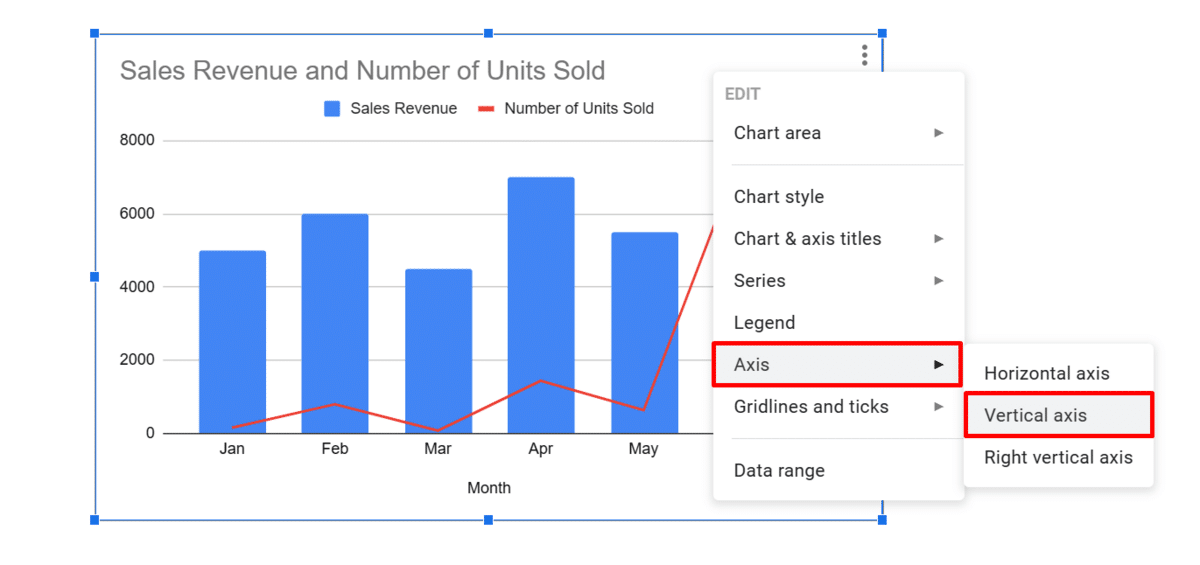
To add a right y-axis, you must open the “Chart editor” panel and edit the “Series” options. While there are many methods to access the said settings, here’s how to add a second axis in Google Sheets in the most efficient way:
- Right-click your chart and select “Series.”
- From the options displayed, choose the label you want to use as your secondary axis. (In this example, we used “Number of Units Sold”).

- The “Chart editor” panel will be displayed on the side.
- In the “Axis” drop-down menu, select “Right axis.”

- Your secondary y-axis should now be inserted, as illustrated below.

Step 4: Customize Your Chart
Besides adding another vertical axis to your chart, you should consider customizing it to ensure it’s clearly labeled and understood. In particular, you can customize the labels in bold and change their colors.
- Right-click your chart and select “Axis” > “Vertical axis.”
- In the “Chart editor” side panel, click the “Bold” icon (capital B) under “Label format.”

- Open the “Text color” selector. Customize your labels by selecting your column color.

- Right-click your chart again, then pick “Axis” > “Right vertical axis.”

- Repeat steps 2 and 3 for your secondary axis.
- Your chart should now look something like this:
Related: Google Sheets Combo Chart: Easy Guide + How-to Video
Final Thoughts
Adding a secondary axis in Google Sheets makes your charts easier to understand, especially when presenting multiple series in a single chart. If you need to insert one, just follow the steps above, and you’ll have your second vertical axis in no time.
Want to set up your spreadsheets quickly? Have a look at our premium templates today and get them at 50% off using the code “SSP.”
Related: