Making a standard presentation is easy, but knowing how to make Google Slides look good is an entirely different challenge. In my guide, I will show you how to make your Google Slides better, both functionally and aesthetically.
Keep reading to learn how to take your Google Slides presentation from good to great!
Table of Contents
1. Choose a Google Slides Theme

Themes ensure your presentation has visually consistent colors, fonts, sizes, and layouts. This goes a long way toward providing a professional and polished appearance, and it’s much easier for the audience to follow along.
- Choose a theme that aligns with the tone and purpose of your presentation.
- Ensure slides have a consistent set of colors, fonts, and layouts.
- Select a visually appealing color scheme and legible font combination.
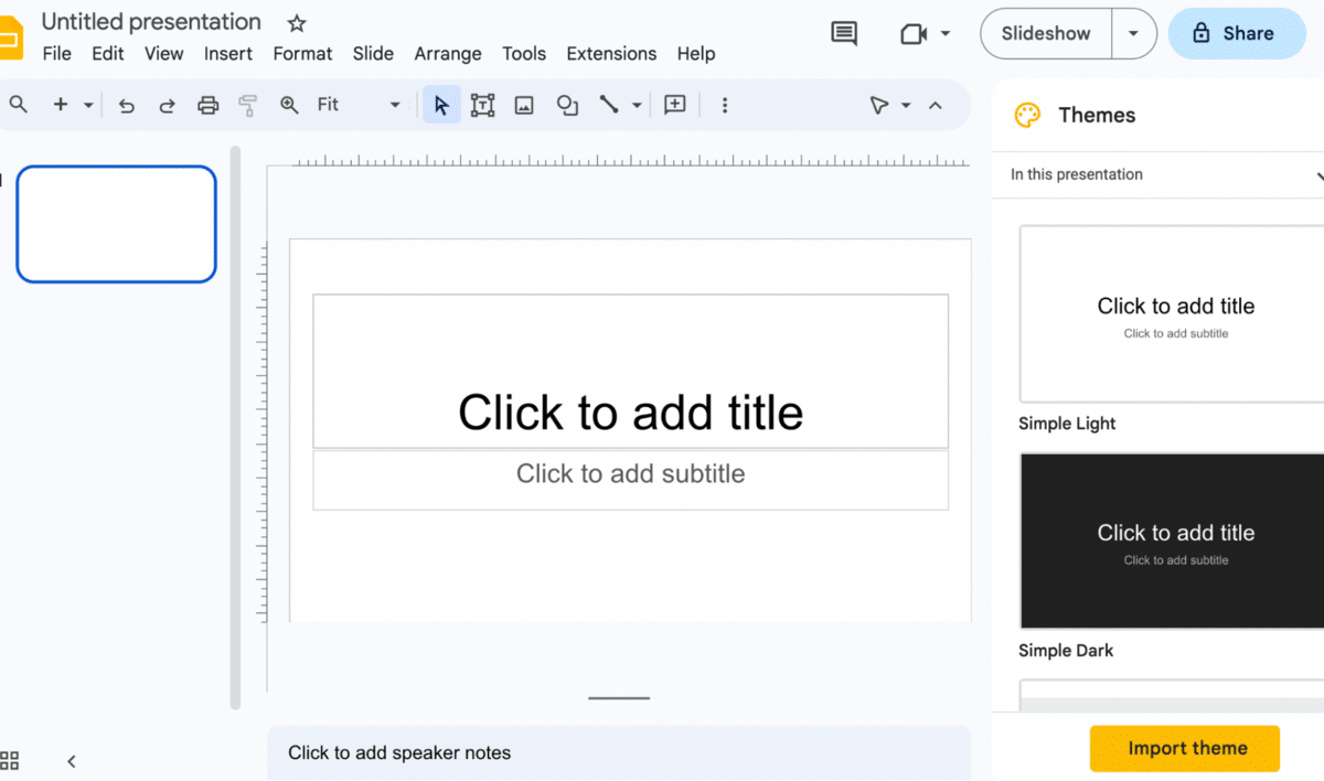
While you can handpick background color palettes, typefaces, and slide layouts, many of the best Google Slides templates are built into the program! In a blank presentation, you’ll find them on the right-hand side.
Creating Your Own Google Slides Theme
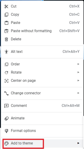
It’s fairly straightforward to create your theme in Slides. Add whatever background color, images, shapes, and page formatting you prefer. Right-click your chosen slide and select “Add to theme.”
Related: Don’t want to make one from scratch? I’ve got you covered with some of my favorite Google Slides templates at the bottom of this article.
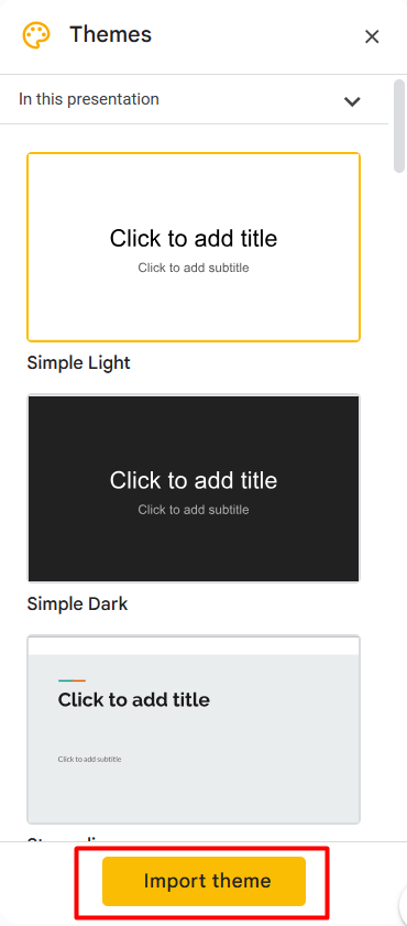
How To Import a Theme to Google Slides
- Create a new presentation or open an existing one.
- Click the “Theme” button.

- Click the “Import theme” button in the pane on the right-hand side of your window.


Note: Importing a theme into your presentation will impact all of your slides. To revert to the previous version, use the “Undo” button by pressing the keyboard shortcut Ctrl + Z (on Windows) or use Command + Z (on Mac).
2. Choosing Color Schemes in Slides
A color scheme is one of the first things your audience will see, so it’s one of the most critical elements. Google Slides offers plenty of color options, including gradients (which can be used for almost all the elements, including background, font, and shapes).
Use color theory principles (like complementary colors) to create combinations that stand out for the right reason. Color psychology is also a great way to express emotions or convey messages purposefully:
- Warm colors (e.g., red, orange, yellow) can express warmth, energy, or even a warning.
- Cool colors (e.g., blue, green, purple) can represent relaxation, sophistication, or security.
Use Color to Make Sections Stand Out
Strategically use color to highlight essential elements (e.g., headings, critical data). To guide the audience’s attention:
- Use vibrant shades that contrast the color scheme.
- Assign specific colors to categories, sections, and team members.
Be Mindful of Contrast
Check that the text and background colors have enough contrast for better reading. The most readable combination is dark text on a light backdrop (or vice versa). In charts and graphs, use color to improve focus and understanding.
Note: Avoid colors that can blend together or present difficulties for people with color blindness.
3. Choosing Text and Fonts
Your chosen font portrays information and dramatically improves your presentation’s overall aesthetic. If you’re trying to make a cool presentation on Google Slides, you’ve got a lot to consider!
Use Clear, Legible, and Easy-to-Read Fonts
Avoid overly decorative or ornate fonts because they can hinder readability (especially when projected on a larger screen). Stick to widely available and compatible fonts across devices like Arial, Georgia, or Open Sans.
Ensure Font Sizes, Weights, and Styles Stand out
Headings should stand out; supporting text should be smaller (or less emphasized). This is done to guide the audience’s attention and improve readability.
Note: While they can add visual interest, excessive use of font styles can be distracting and more challenging to read.
Complement Font Pairings
Select a combination of fonts that contrast each other and create visual interest. Consider using online resources or font pairing tools for inspiration. We recommend sticking to a maximum of two to three fonts to prevent visual chaos.
Use Fonts That Align with Branding Guidelines
If your website uses a specific font and color scheme, incorporate them into your presentations to support the organization’s visual identity.
Align Text and Spacing
Align text and leave enough white space for a clean, organized look.
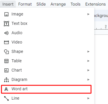
4. How to Add Word Art to Google Slides:
- Select “Insert” > “Word Art” from the drop-down menu.
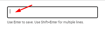
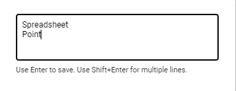
- A text box will appear where you can type the text you want to be in Word Art format.

- For multiple lines of text, press Shift+Enter after every line.
- Type your text, then press the “Enter” key on your keyboard.
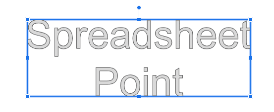
There you have it! Your Word Art will now appear on your selected slide.
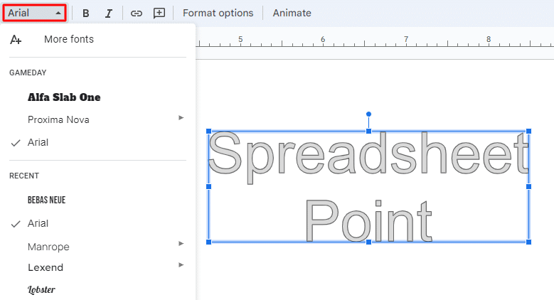
Note: If you want to edit the font or color, click the Word Art, and a formatting box will pop up.
5. How To Add Google Slides Transitions
You can ensure seamless transitions from slide to slide with a couple of clicks:
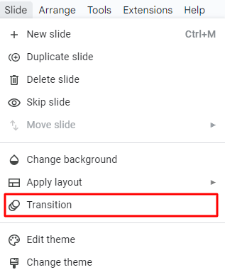
- In the menu bar, click on “Slide” > “Transition.”
- You can also right-click on the desired slide and select “Transition.”

- You can also right-click on the desired slide and select “Transition.”
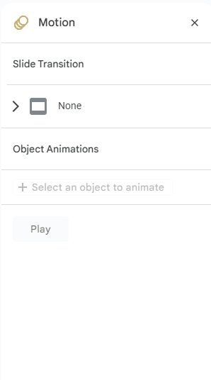
- In the “Motion” pane, select “Slide Transition” > “Transition effect” from the options available.
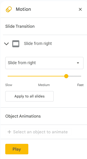
- This will apply the transition to the current slide.

- This will apply the transition to the current slide.
- Adjust the transition speed with the duration slider.

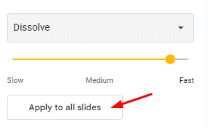
- If you want to apply the selected transition to all slides in your presentation, click “Apply to All Slides.”
- To preview your presentation, click the “Play” button.
- Any transitions applied to skipped slides won’t play during the preview.
- Click the “Stop” button when you’re finished.
Tip: You can configure your presentation to play automatically using Google Slides’ automatic transitions. This removes the need to press the spacebar or click on the screen to trigger the next slide.
How Many Transitions Are Available in Google Slides?
At the time of writing, Google Slides offers seven built-in transitions. There is currently no option to add or download additional transitions.
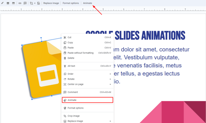
6. How To Add Animations on Google Slides
Enhance the visual appeal of your slideshow by incorporating animations (i.e., effects that make elements move). They can be applied to almost every object, from images to tables to bullet points. Follow the steps below to add animations to your slides:
- Right-click on the object and go to “Animate.” Alternatively, you can click on “Animate” on the toolbar.

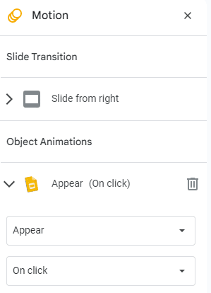
- Under the “Motion” pane, go to “Object Animations.”
- You’ll notice that your selected object’s “Animation Type” is set to “Appear.”
- This is the animation type applied to all objects by default.

- Select an animation type:
- Fade in: This transition introduces the object by gradually fading it in.

- Fly in from left/right or top/bottom: The object flies into the slide from one side.
- Zoom in: The object starts small and slowly increases in size.
Under “Animation Type,” you’ll see the “Start Condition” drop-down. Open it to select whether the animation should play upon clicking a slide, with the previous animation, or after the previous animation.
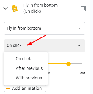
Note: The start conditions “With Previous” and “After Previous” will only work if there is another animated object immediately before your selected object.
- Set the speed of the animation by moving the slider.

- To add more animations to your object, select “Add Animation.”
- Set the type and speed. In this example, I’ve set the start condition to “After Previous” to start the following animation once the previous animation ends:

- Set the type and speed. In this example, I’ve set the start condition to “After Previous” to start the following animation once the previous animation ends:

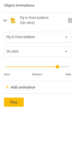
- Click on the “Play” button to preview your animation(s).
- Click the “Stop” button to end the preview and continue working on your slideshow.
Related: Google Slides vs. PowerPoint: Which Program Is Better?
Tips for Using Transitions & Animations
We recommend using these effects sparingly to emphasize essential elements or facilitate the flow of information. Avoid using them solely for decorative purposes.
Pick Subtle and Smooth Transitions
Flashy or distracting effects can overshadow your content. Your goal is to provide a seamless flow between slides. Try a simple fade or slide transition.
Adjust the Timing and Duration
Transitions shouldn’t be too fast or slow. Aim for a natural pace that allows the audience to follow along comfortably.
Highlight Specific Elements Within a Slide
Selectively animating text, images, or charts can emphasize critical points (or reveal information) in a controlled manner. Avoid excessive animation that appears gimmicky or distracting.
Be Consistent
Choose a specific transition style or animation effect — then stick to it. This will help you avoid distractions and inconsistencies.
7. Using Images and Videos

Adding images and videos to slides can greatly enhance visual appeal and engage your audience. Here are some points to consider when choosing an image:
- Choose images that are relevant to your content.
- Use high-quality images that are clear, crisp, and well-composed.
- Use images that evoke emotions or illustrate concepts.
- Strike a balance between text and images on your slides.
- Consider using images as slide backgrounds.
- Adjust transparency or apply overlays to maintain readability.
- Experiment with image formatting options (e.g., cropping, resizing, transparency, brightness).
8. How To Include Infographics in Google Slides

Infographics in a presentation can communicate complex information effectively. Use the drawing feature in Google Slides to make attractive and informative infographics. Keep these points in mind when using infographics:
- Keep your infographics clean and basic.
- Choose from bar charts, pie charts, line graphs, timelines, flowcharts, maps, and diagrams.
- Avoid overwhelming your audience: Use limited details, succinct labeling, and clear graphics.
- Use custom colors, typefaces, and visual styles to reflect your presentation or company identity.
- Highlight the most significant facts or data.
- Make sure infographic details are simple to read and understand.
How Can Poor Design Affect A Presentation?
Your presentation could be significantly impacted if you haven’t learned how to make Google Slides look professional. Here’s why:
Lack of Clarity
Poor aesthetics often make it more difficult for the audience to grasp — or focus on — details. Avoid cluttered or crowded presentations, imprecise typefaces, and insufficient color contrast. Key points might be missed, or the audience may get distracted.
Unprofessionalism
A disorganized presentation might give the appearance of being unprofessional, affecting the presenter’s credibility.
Poor Readability
Small fonts, poor contrast, and ornamental typefaces can strain the eyes and make it difficult to follow a presentation.
Lack of Visual Appeal
A presentation with a dull or unappealing design may fail to catch attention (and make the material less memorable).
9. A Few of My Favorite Google Slides Templates
If you’re not interested in using stock templates (let alone creating your own), I’ve got you covered with these slick presentations:
Ganymede Template

The Ganymede template offers a modern style with bold text for extra impact. Whether you aim to make a lasting impression with your pitch deck — or simply want to use colors that align with your brand — this template suits your needs.
Dynamic Business Template

An effective project management report is characterized by clarity, and your color scheme plays a significant role. I love the streamlined theme of this Google Slides template and appreciate that a blank timeline chart, roadmap diagram, and funnel are included for incredible customization.
Frequently Asked Questions
Can You Make Google Slides Vertical?
You can make Google Slides vertical by following simple steps:
- Open a new or existing presentation.
- Click the “File” button to open a drop-down menu.
- Click the “Page setup” option.
- Select the “Custom” option and set your desired size (width and height)
- Hit “Apply” to save the changes.
Can You Do Hanging Indent in Google Slides?
Yes. There are three methods to do hanging indent in Google Slides:
- The ruler (blur triangle) along the top to position your hanging indent.
- The keyboard Tab key for quick indentation adjustments.
- The “Formatting Menu” on the toolbar:
- Select “Text Fitting”> “Indention” > “Hanging” > “First line indent” > “Hanging indent” to the desired amount.
Are There More Google Slides Templates?
Yes. There are many free Google Slides templates out there. Here are ten additional templates for you to use.
Bottom Line
Any presentation’s goal is to keep the audience’s attention, and you can do that with a balance between aesthetics and practicality.
I hope I’ve helped you learn how to make your Google Slides look good, express your message, and captivate your audience. If you need more assistance, Spreadsheet Point’s premium Google Slides templates can take the pressure off you. When you use the code SSP, you’ll get 50% off!
Related: