Those who switch from using Excel to Google Sheets often notice one formatting gap right away, Google Sheets does not offer a built-in diagonal border to split a cell the way Excel can.
Still, if you want the look of a diagonal split header in Google Sheets, a few reliable workarounds get you there.
Quick pick:
- Fastest: type the two labels with a “line” character between them, then rotate text (good enough for many sheets).
- Best looking: draw a diagonal line as a Drawing object and position it over the cell (clean visual, but it behaves like an object).
- Most stable with sorting/filtering: use a SPARKLINE diagonal for a blank cell, or insert a simple diagonal line image in the cell when you need it to move with the data.
Table of Contents
Inserting a Diagonal Line With Text in the Cell
Because Google Sheets does not include a true “split cell diagonally” option, we have to mimic the effect. A common use case is the top-left header cell of a summary table, where you want the row header and column header to share one cell.
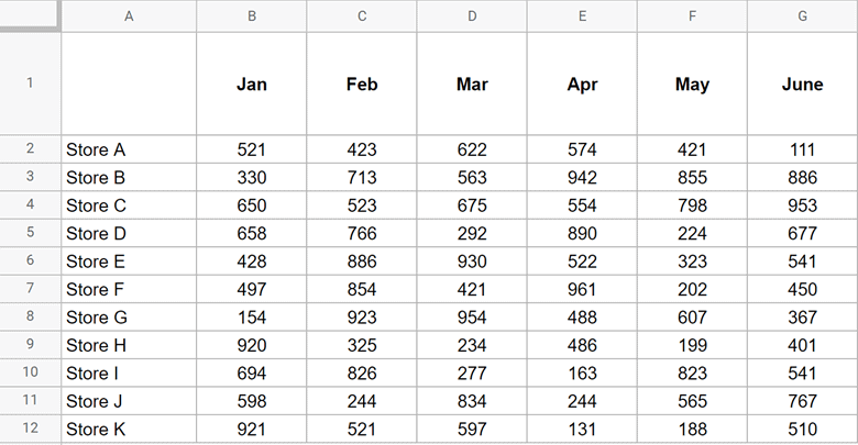
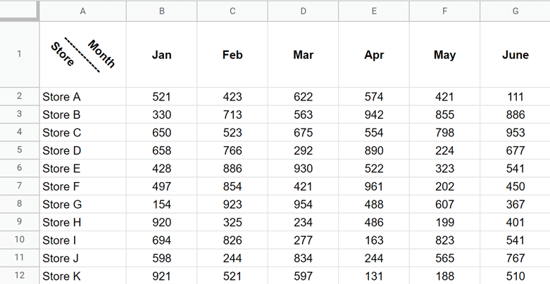
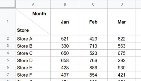
Suppose you have a dataset like the one below, and you want cell A1 to show:
- Month above a diagonal
- Store below a diagonal
Below are two practical methods that work well.
Method 1: Using Text Rotation (Tilt) to Fake a Diagonal Line
You cannot insert a diagonal border in a Google Sheets cell, but you can type a “line” character and rotate the cell’s text so the line appears diagonal.
Steps:
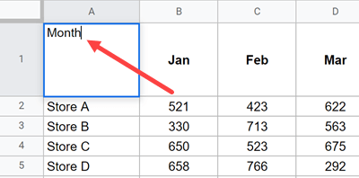
- Select the cell you want to split (A1 in this example).
- Type Month in the cell.

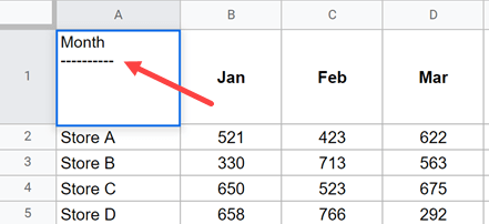
- While editing the cell, press Alt + Enter (Windows) or Option + Enter (Mac) to add a line break. This lets you type on the next line within the same cell.
- Type a series of dashes (for example, ———-).

- Press Alt + Enter (Windows) or Option + Enter (Mac) again.
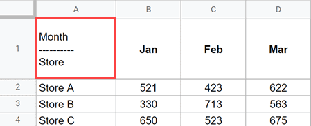
- Type Store.
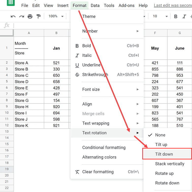
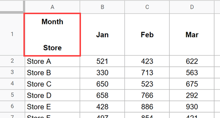
At this point, your cell will look like this:
Now rotate the text so the “line” looks diagonal.
Steps:
- Select the cell (A1).
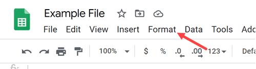
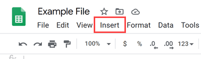
- Click Format.

- Hover over Text rotation (sometimes shown as Rotation).
- Choose Tilt down.

- Adjust row height and column width as needed. Center align and bold can help the effect read cleanly (optional).
Result:
Note: With this technique, avoid adding “fake border” characters in the cell, because rotation tilts anything typed in the cell. Standard cell borders remain normal, but they may visually clash with the rotated diagonal effect.
Optional: You can generate the same three-line content with a formula, then apply the same Tilt down rotation.
="Month"&CHAR(10)&REPT(CHAR(8213),6)&CHAR(10)&"Store"Method 2: Draw a Diagonal Line (Cleaner Look) and Add the Text
If you want the diagonal line to look cleaner than a row of dashes, you can draw a diagonal line and position it over the cell. This method usually looks best visually.
Steps:
- In cell A1, type Month.
- Press Alt + Enter (Windows) or Option + Enter (Mac) to add a line break.
- Repeat the line break 2 to 3 more times to create vertical space between the two labels.
- Type Store.

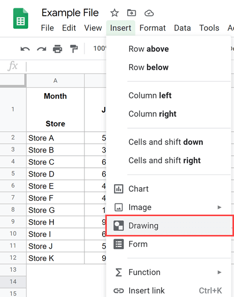
- Click Insert.

- Click Drawing.

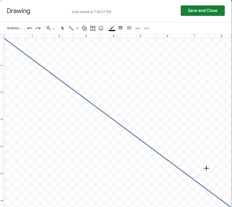
- In the Drawing dialog, click the Line tool.

- Draw a diagonal line.

- Click Save and Close to insert the line into the sheet.
- Resize and place the line within cell A1.

- If needed, add a few spaces before Month to align it nicely above the line.

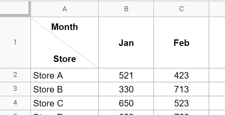
Result:
Important limitation: A Drawing line is an object placed on top of the sheet, not part of the cell. If you resize the cell, hide a column, or filter your range, the line may not move or resize with the cell.
More stable alternative: If you want a diagonal line that behaves like data (moves with sorting, filtering, and row changes), insert an image in the cell (Insert > Image > Image in cell) and use that as the diagonal divider. You can create a simple diagonal line image once and reuse it wherever needed.
Inserting Just a Diagonal Line in a Blank Cell
If all you need is the diagonal line (no text in that same cell), a SPARKLINE trick works extremely well. Because the diagonal is created by a formula, it stays with the cell when you filter, sort, or hide rows and columns.
Diagonal line from top-left to bottom-right:
=SPARKLINE({1,0},{"color","black","linewidth",2})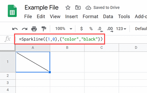
Diagonal line from bottom-left to top-right:
=SPARKLINE({0,1},{"color","black","linewidth",2})Tip: If you get a formula parse error, your locale may require semicolons. Try:
=SPARKLINE({1,0};{"color","black","linewidth",2})Limit: Because the cell contains the SPARKLINE formula, you cannot also type text into that same cell. Use this method when you only need the diagonal line.
Those are the most practical ways to mimic a diagonal split cell or insert a diagonal line in Google Sheets. The best method depends on whether you care most about looks, stability with filtering, or speed.
Troubleshooting and formatting tips
- The diagonal looks off-center: Increase row height, widen the column, and center align the cell content.
- The tilt method looks jagged: Use fewer characters, increase font size slightly, and adjust row height until the line reads cleanly.
- The drawing line drifts after edits: Prefer an in-cell image for the diagonal line when stability matters.
- Printing shifts objects: Avoid floating Drawing objects for print-focused sheets. Use SPARKLINE for line-only or an in-cell image divider.
FAQ
Does Google Sheets have a built-in way to split cells diagonally?
No. Google Sheets does not include a native diagonal border or a “split cell diagonally” feature. To get the look, you use workarounds like text rotation, a drawn line, an in-cell image, or a SPARKLINE diagonal.
How is splitting a cell different from adding a diagonal line?
Adding a diagonal line is purely visual, it helps the cell look split for labeling. A true split would create two independent areas inside one cell that can hold separate values, formatting, and references. Google Sheets cells cannot truly split into two separately addressable regions, so these methods only mimic the appearance.
When is it helpful to add diagonal lines in Google Sheets?
Diagonal headers help when you have a compact summary table and want the top-left cell to represent both axes, like “Month” across the top and “Store” down the side. It is common in cross-tab reports, schedule grids, simple dashboards, and printable summaries where space is tight.
What is the easiest formatting hack for readability on a Google Sheets dashboard?
If you want readability fast, keep labels simple and consistent. Two quick wins: freeze your header row and first column (View > Freeze), then apply alternating row colors for the data region. For headers, using a two-line label inside a single cell (Alt/Option + Enter) often reads cleaner than diagonal splits, especially on dashboards that people scan quickly.
Which method holds up best when I sort, filter, or hide columns?
SPARKLINE (for a line-only cell) holds up best because it is part of the cell. For a diagonal divider that needs to move with the sheet, an image inserted in the cell is typically more stable than a floating Drawing object.
Can I keep a normal border around the cell and still show a diagonal split?
Yes, but expect tradeoffs. With the tilt method, the “diagonal” comes from typed characters, so rotation can make the cell look busy next to standard borders. The cleanest approach for borders plus diagonal is usually either a SPARKLINE diagonal (line only) or an in-cell image divider, then keep your borders standard.
What is the best option if I plan to print the sheet?
Avoid floating Drawing objects for print-first layouts, because objects can shift. Use SPARKLINE for a blank diagonal cell, or an in-cell image divider when you want a consistent diagonal that prints reliably.
Is there a more accessible alternative to diagonal headers?
Often, yes. Diagonal headers can be harder to scan and less friendly for screen readers. A simple alternative is to label A1 as something like “Store / Month”, then use standard headers across row 1 and down column A. Another option is a two-row header with merged cells, which reads clearly and stays fully “sheet-native.”