A new Gallup poll finds that 40 percent of American women ages 15 to 44 say they would leave the United States permanently if they could. In the late 2000s that figure sat in the teens, and by 2014 Gallup puts it near 10 percent. In a little over a decade the share has roughly quadrupled for younger women while men the same age sit at 19 percent.
For people who live in spreadsheets, that’s a time series you can track and test inside a generational trend grid in Google Sheets.
Gallup reports a 21 point gap between younger women and younger men who want to move abroad, the widest gender gap they have ever recorded on this question. Older Americans are far less likely to say they want to leave, around 14 percent of women 45 and older and 8 percent of men that age. In most other wealthy countries, younger women who say they want to emigrate tend to cluster around the 20 to 30 percent range, which makes the American spike stand out.

Life circumstances barely move the line. According to the poll, single women come in around 45 percent, married women around 41 percent. Women without children are at roughly 44 percent, those with children at about 40 percent. Political approval does move it.
There’s a 25 point difference between Americans who approve of national leadership and those who do not, with disapprovers far more likely to want out. The pressure is concentrated in Gen Z and millennial women who are watching big fights over reproductive rights, healthcare, and basic institutional trust and deciding they may be better off somewhere else.
| Group | Emigration desire (%) | Gender gap vs men (pp) |
|---|---|---|
| Women, 15–45 | 40% | +21 |
| Women, 45+ | 14% | +6 |
This sits on top of a longer running story about Americans looking abroad for opportunity, documented in sources like historical emigration data. The difference now is how sharply the trend tilts toward younger women.
To move beyond the headline, we could start by building a generational trend grid in Google Sheets. Create a base table with columns for year, age band, gender, marital status, children at home, share who want to leave, leadership approval, and an identifier for the underlying survey. Each row becomes one measured group in one year.
You can pull Gallup figures and other public tables into Sheets with functions like IMPORTXML and IMPORTHTML. Once the data is in, use a second tab to reshape it into a clean grid that groups women by birth cohort instead of just by age band.
For example, treat women born 1981 to 1996 as millennials and women born 1997 to 2012 as Gen Z. Your grid can then track how emigration sentiment for each cohort changes year by year as they move through different life stages.
Analyzing the spike with basic formulas
With the grid in place, the analysis is classic spreadsheet work. The QUERY function in Google Sheets is the easiest way to slice the table into focused views. You can pull out only younger women, or only respondents who disapprove of national leadership, or only women with children at home, and calculate their average desire to migrate by year. If you need more complex filters, there is also a guide on using QUERY with multiple criteria.
To see what really drives the spike, drop those segment averages into a correlation sheet. Use the CORREL function to measure how tightly desire to migrate is linked with leadership approval, age, or parental status. Combine that with a simple standard deviation calculation to check whether a given year is a genuine outlier or mostly noise. The result is a compact correlation matrix that shows which factors actually seem to move the numbers.
Once the formulas are working, layer them into a visual summary. With a Google Sheets dashboard, it’s simple to show the gender gap across time, the differences between cohorts, and the divergence between the United States and other wealthy countries.
A generational trend grid lets you move the argument out of the comment section and into a model. It shows plainly when the line for younger women began to pull away from younger men, how that tracked major political events, and whether the increase has stabilized or is still climbing.
But we don’t need an advanced template to get the gist of this trend. Just looking at Millennial and Gen Z women for preferences, we can use Gallop’s data to visualize the change from 2008 to 2014 to 2024.
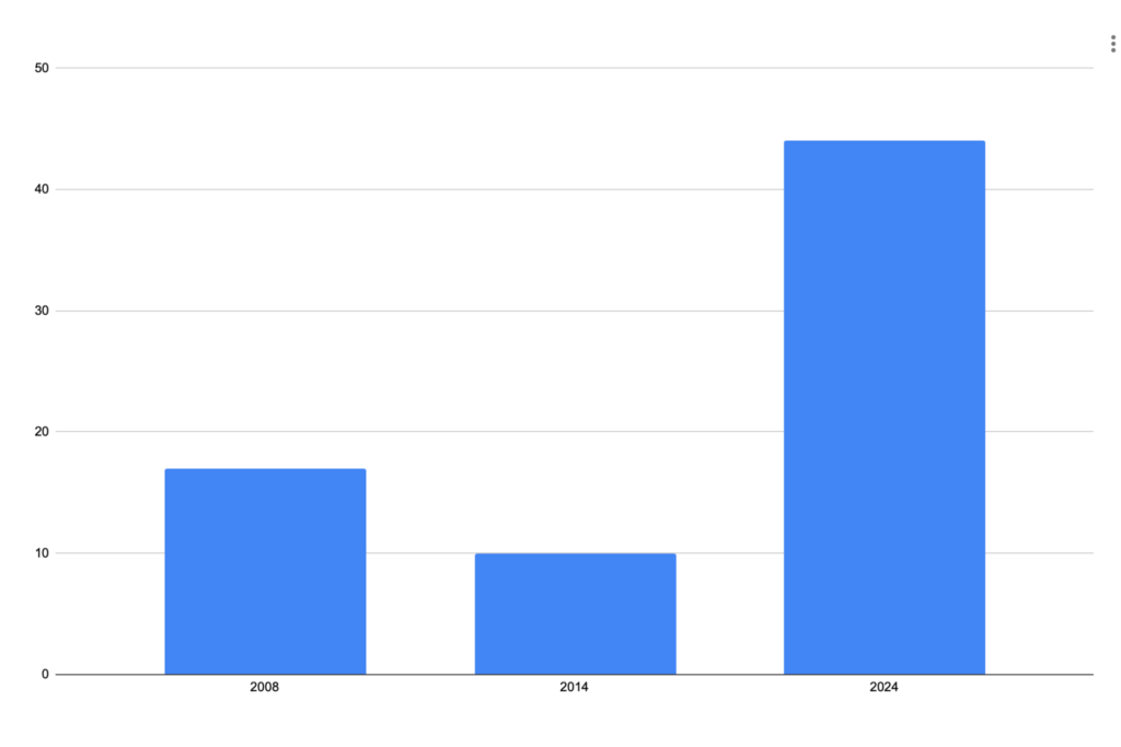
Gallup is clear that desire to migrate is not the same thing as a plane ticket, and millions of women who say they want out will never actually leave. For someone who lives in spreadsheets, the value of this poll starts with the headline jump from 17 percent to 40 percent. But it goes further. Anyone can gather the data to build a living model, updated as new polls come in, that shows this shifting perspective across generations.